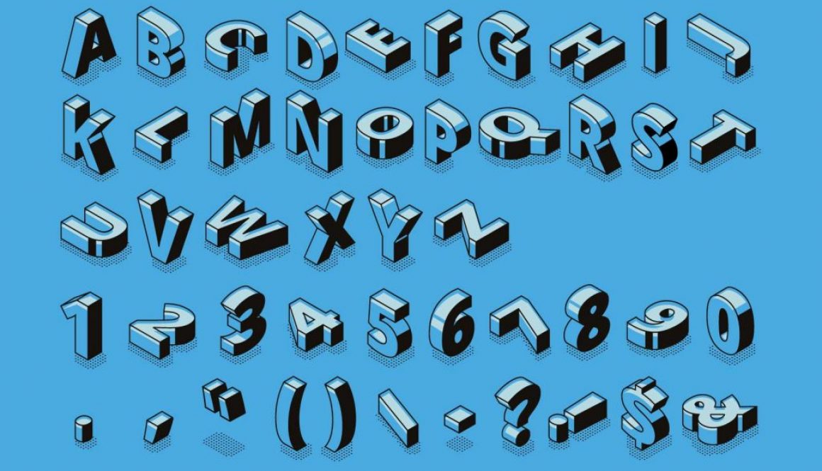
A Word on Typography
We’ve all been there. Spending countless minutes looking for the perfect font to compliment an email, document, or heading. It’s time consuming, frustrating, and you can never seem to find quite what you were looking for. But you keep searching, because something as simple as a font can make a big influence on how your text looks.
We think this principle should be considered in the marketing field too. From web design, to digital advertising, and even printed materials, fonts and typography should never be overlooked, especially when associated with the identity of your business. We hope this post gives you some insight into digital typography, and inspire you to use it to your advantage in your business’s marketing.
First and foremost, different types of fonts. The most basic font classification separates fonts with and without Serifs. These are fonts with small overhanging designs, commonly seen in printed text. Sans serif (without serifs) fonts have a cleaner, more slender look, and are used for digital applications.
Serif
Sans Serif
Next up, font pairs. In almost all text, both digital and physical, you will notice there are two distinct types of text: Headings text, and Body text. Headings are generally emphasized in some way, whether by size, weight, color, or style. They represent titles, or other information that needs to stand out. Body text is smaller, more standard looking text. It is formatted into paragraphs, and elaborates on the title.
It is important that both types of text are used consistently throughout your branding to give your business its own look. Commonly, both the heading and body text use the same font, however, often times you can use a stylish heading font to compliment an easy-to-read body paragraph. These are called font pairs.
Finding the perfect font pair can take some time, but is used correctly, it can give your brand a distinct and recognizable look. Plus, you only need to do it once, and then it’s just a matter of following your guidelines. For example, all the text on our site uses the Open Sans font for both headings and body text. Take a look below for a couple examples of font pairs.
Roboto Condensed & Cabin
All of this text is editable. Simply click anywhere in the paragraph or heading text and start typing. You can copy and paste your own content in to see what it looks like with these font combinations.
Playfair Display & Source Sans
All of this text is editable. Simply click anywhere in the paragraph or heading text and start typing. You can copy and paste your own content in to see what it looks like with these font combinations.
Monteserrat & Merriweather
All of this text is editable. Simply click anywhere in the paragraph or heading text and start typing. You can copy and paste your own content in to see what it looks like with these font combinations.
Abril Fatface & Poppins
All of this text is editable. Simply click anywhere in the paragraph or heading text and start typing. You can copy and paste your own content in to see what it looks like with these font combinations.
Julius sans one & Monda
All of this text is editable. Simply click anywhere in the paragraph or heading text and start typing. You can copy and paste your own content in to see what it looks like with these font combinations.
There are several online resources you can visit to experiment with different fonts. We’ll link a couple at the end of the article. Make sure to look around and find something that suits your business, but at the same time is eye-catching and not bland. Also avoid anything too extravagant or difficult to read.
Now that we’re done with the basics, let’s move on to font styling. It’s easy to type out simple black text in a block but it’s near impossible to stand out doing so. In today’s online world, you need to make your text stand out. Bright colors, unconventional formatting, and unique animations are your best friends here.
Take a look at the text below (you can edit it too):
Based on traditional rules,there are many things wrong with this text. The font color is too light and matches the background, the left margins aren’t aligned with one another, and the line height is far too small for the large text size. It’s a mess.
However, a simple shadow makes the text look elegant and refined. As orthodox as it may sound on the surface, this heading could perfectly compliment several projects, for example a wedding planner, or a bakery.
Here’s another example:
This example follows conventional rules a bit better than the last example. It uses a different technique to stand out: the color. Instead of using a solid color, or even a gradient, it uses a saturated picture for its fill. Combined with the bolded characters, and if you’re viewing this on a desktop the parallax effect, it looks almost like the letters are cut out of the page revealing something behind it. We imagine this kind of text serving a music streaming platform, or a street wear brand perfectly.
Ignoring the technical aspects of both of these examples, they serve one purpose, and they do it well: Stand out. And this can go a long way on the web. All you need to do is make an impression on a wandering set of eyes, and you could find yourself a new customer.
We only showcased two simple ways to make your headings pop, and a couple different font pairs, but once again, there are thousands of online resources to discover more ideas, and curation websites full of projects to inspire you. We hope you take something from this article, and hit us up if you use the information to create something of your own.
Discover Fonts and Font Pairs
Google Fonts
Adobe Fonts
FontPair

